SNYPR 2.0 was more than just a redesign—it was a complete reimagination of what a digital lacrosse training experience could be. The original app had heart and served a strong purpose, but as the sport grew and users’ expectations evolved, it was clear we needed to take things to the next level. I led the creative direction and product strategy, working closely with our development team to bring that vision to life. Together, we rethought every part of the platform—from functionality to feel—introducing new features, refining the interface, and shaping an experience that feels intuitive, motivating, and tailored for how athletes train, connect, and grow today. It was a true team effort, built on a shared passion for the sport and a drive to build something meaningful for the lacrosse community.
Branding and Logo Redesign
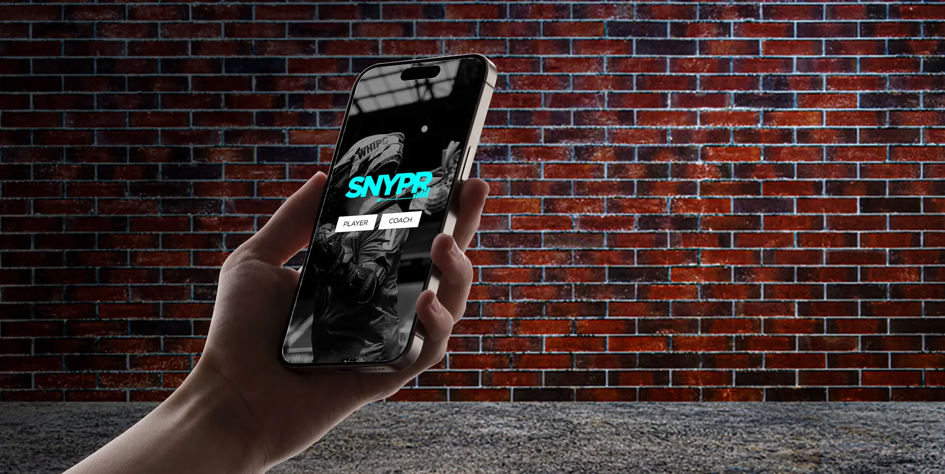
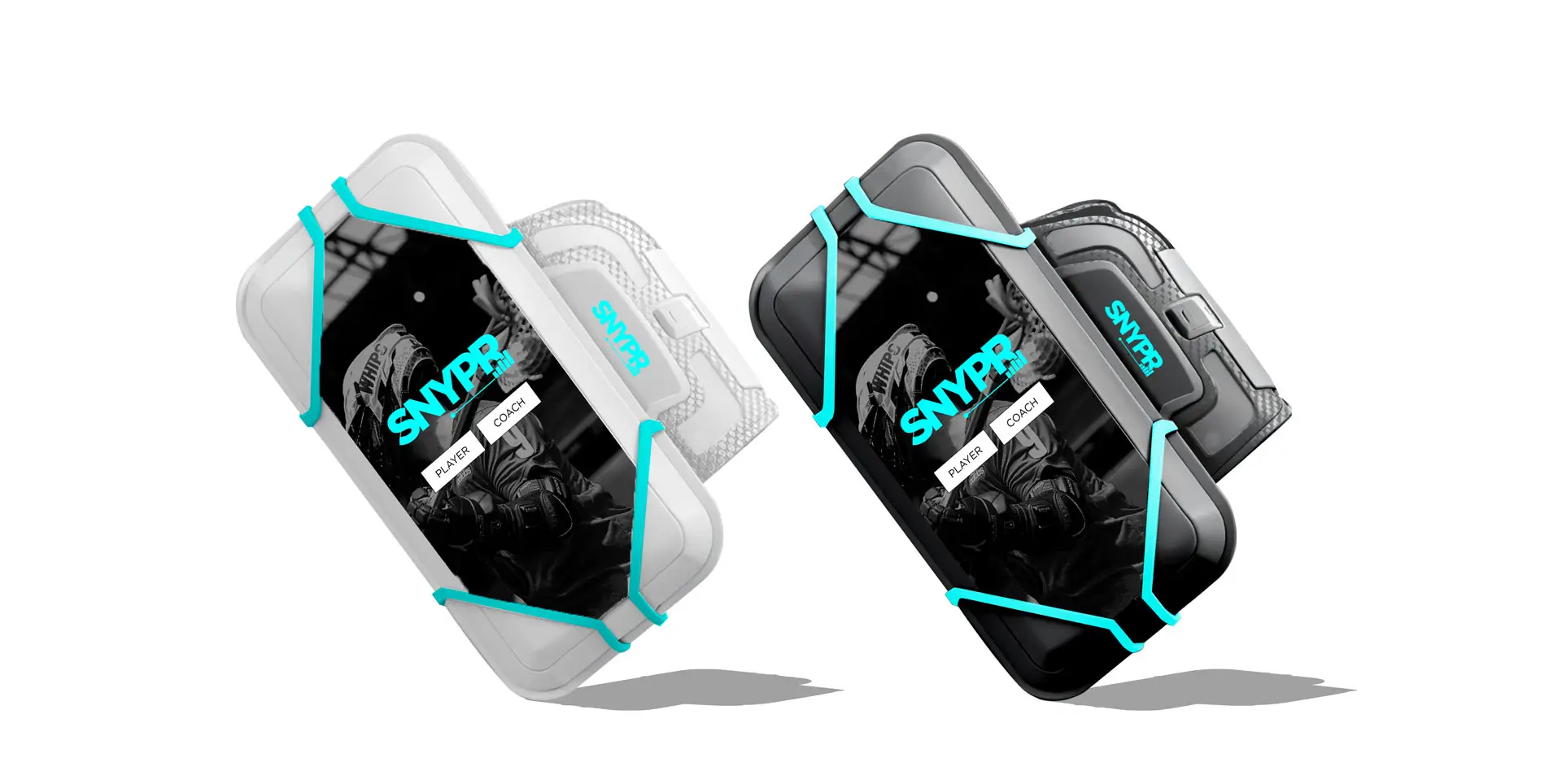
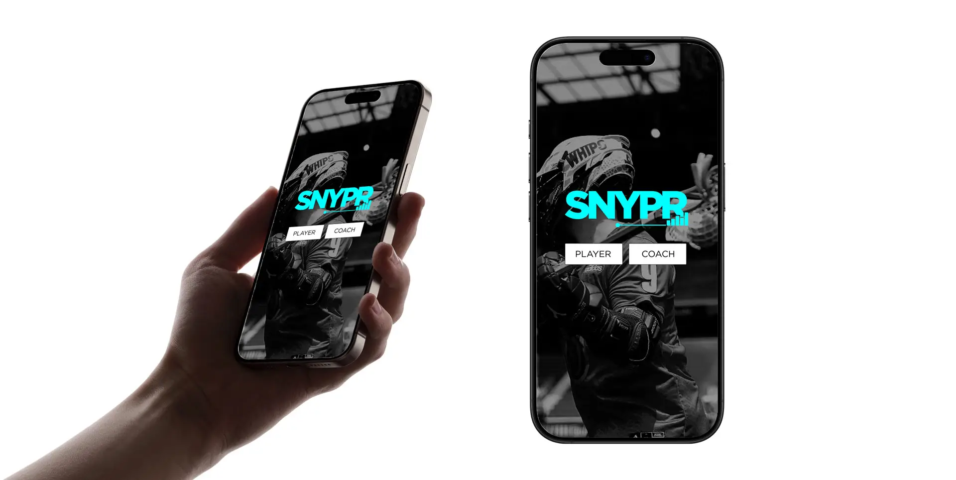
When we set out to redesign the logo and brand system, we knew we needed to strike a careful balance—honor where the brand started, while opening the door for where it could go. We kept a thread of the original identity but introduced a fresh energy that felt bold, modern, and versatile. The new logo was designed to be more universal, giving SNYPR room to grow beyond lacrosse into other sports and training spaces in the future. At the same time, we retained a nod to lacrosse in the app icon—subtle but intentional—so our core audience still felt seen during the shift. We reworked the typography, color palette, and overall visual language to better reflect the energy and ambition of young athletes. That new identity would extend across the app, social channels, gear, and packaging—bringing consistency, confidence, and momentum to the brand.
New Arm Band Concept and Creation
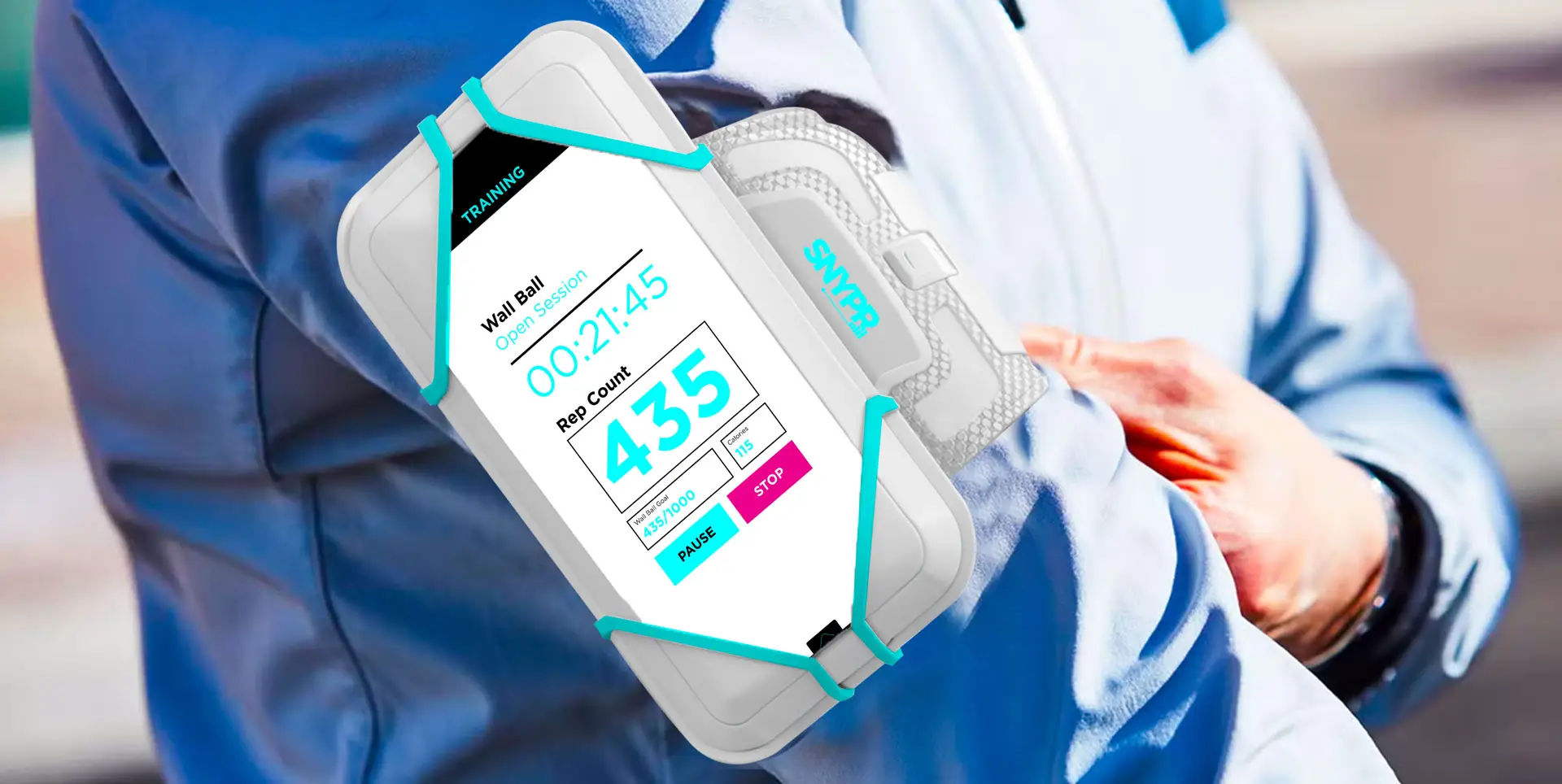
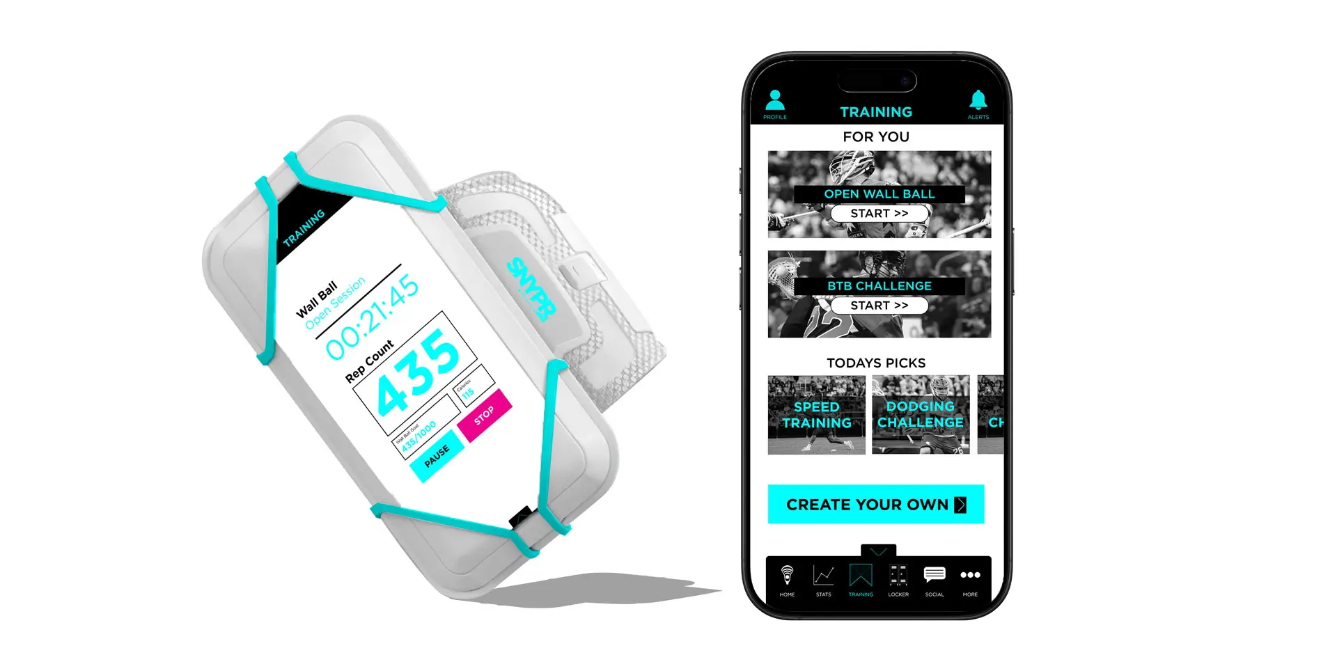
TThe SNYPR armband is more than an accessory—it’s the bridge between physical action and digital feedback. With 2.0, we reimagined the design from the ground up. Working closely with our product team, we developed a lighter, more breathable band that could withstand real wear and tear. It needed to stay secure during intense wall ball reps while still being comfortable enough to forget you were even wearing it. We also saw this as an opportunity to make the armband an extension of the brand—incorporating the updated visual system and giving it a clean, athletic edge.
UX/UI Redesign and Improvement
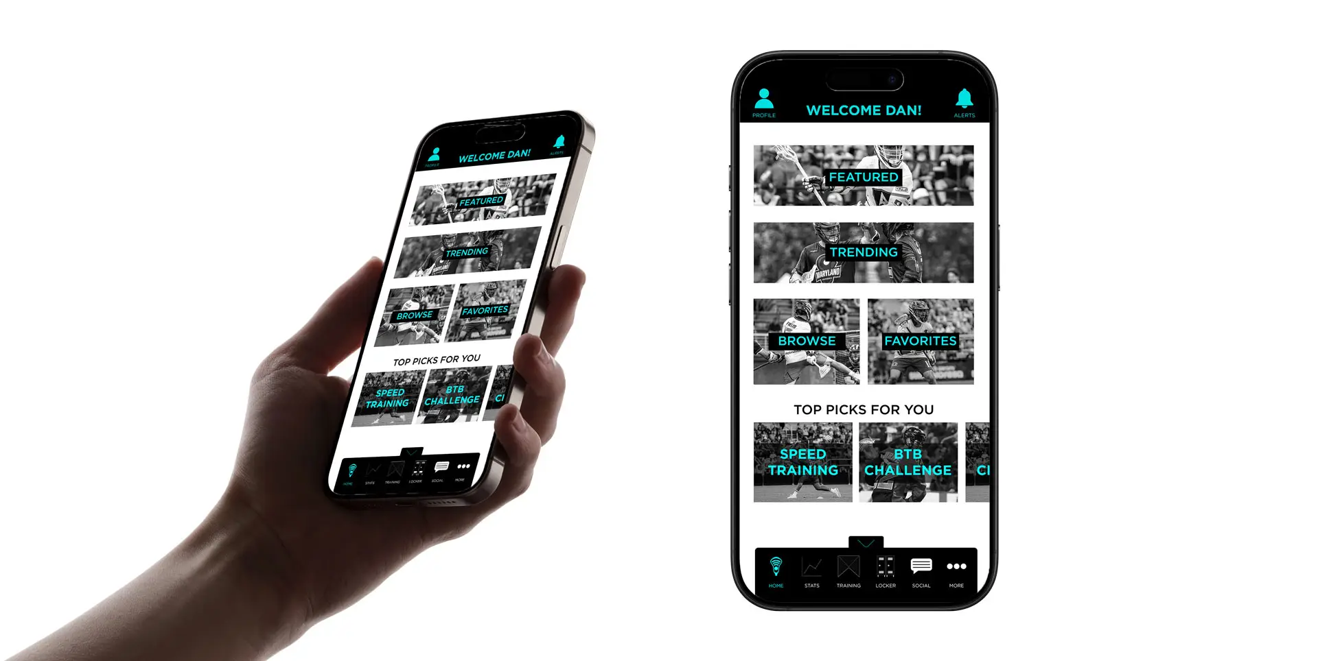
One of the first things I tackled was the app’s user flow—it just didn’t feel as intuitive or inspiring as it could be. So we went back to the drawing board. I redesigned the wireframes and UI from scratch, focusing on cleaner navigation, faster access to key features, and a design language that felt sharp but not overwhelming. Every screen was built with athletes in mind—how they think, what motivates them, and what keeps them coming back. The result is an experience that feels fast, fluid, and fun to use.
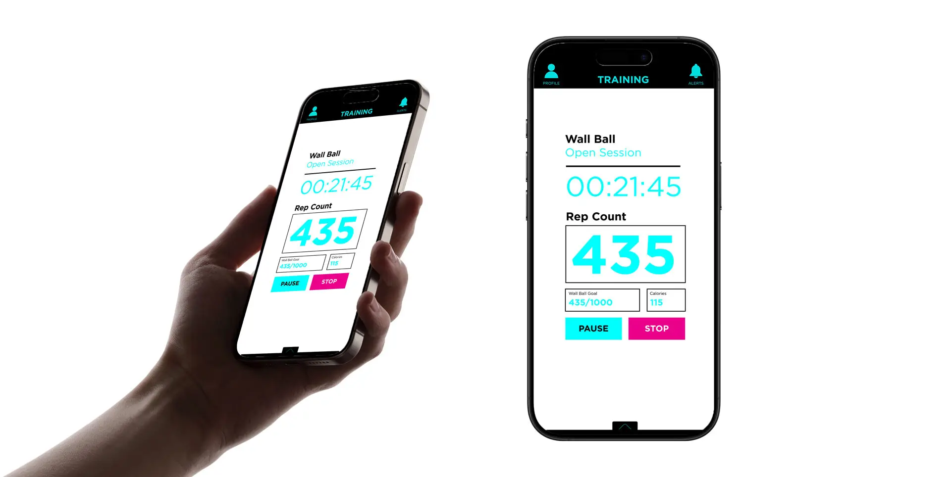
Stats and Analytics Dashboard
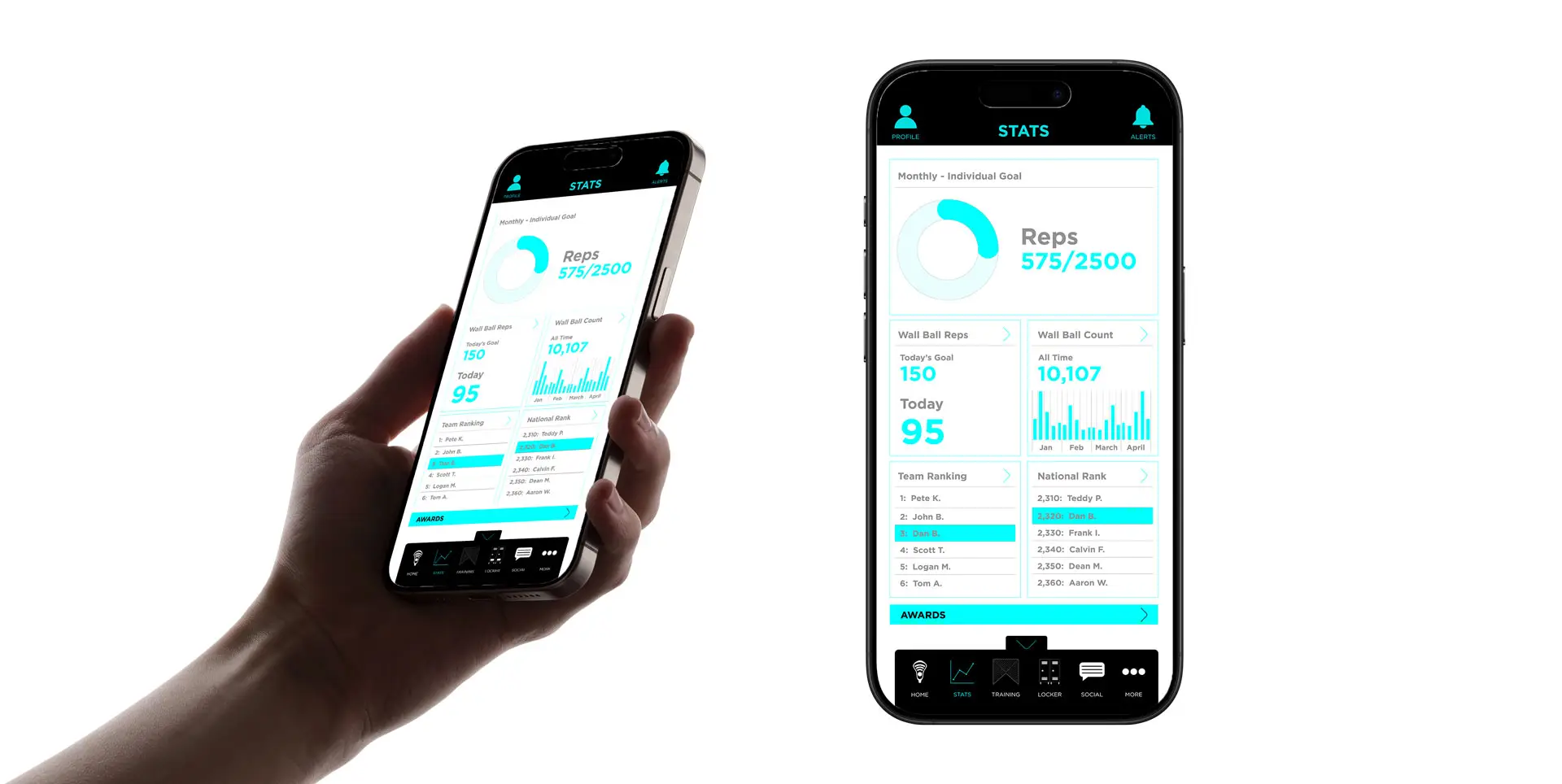
We knew players were hungry for more feedback. The new stats dashboard became one of the most powerful parts of the app. We designed it to track reps, consistency, streaks, and leaderboard positions in a way that’s both motivating and easy to understand. Players can see their progress over time, while coaches and teams can get a big-picture view of how their squads are doing. It’s data that doesn’t just inform—it pushes you to keep going.
Training Hub: Drills, Challenges, and Progression
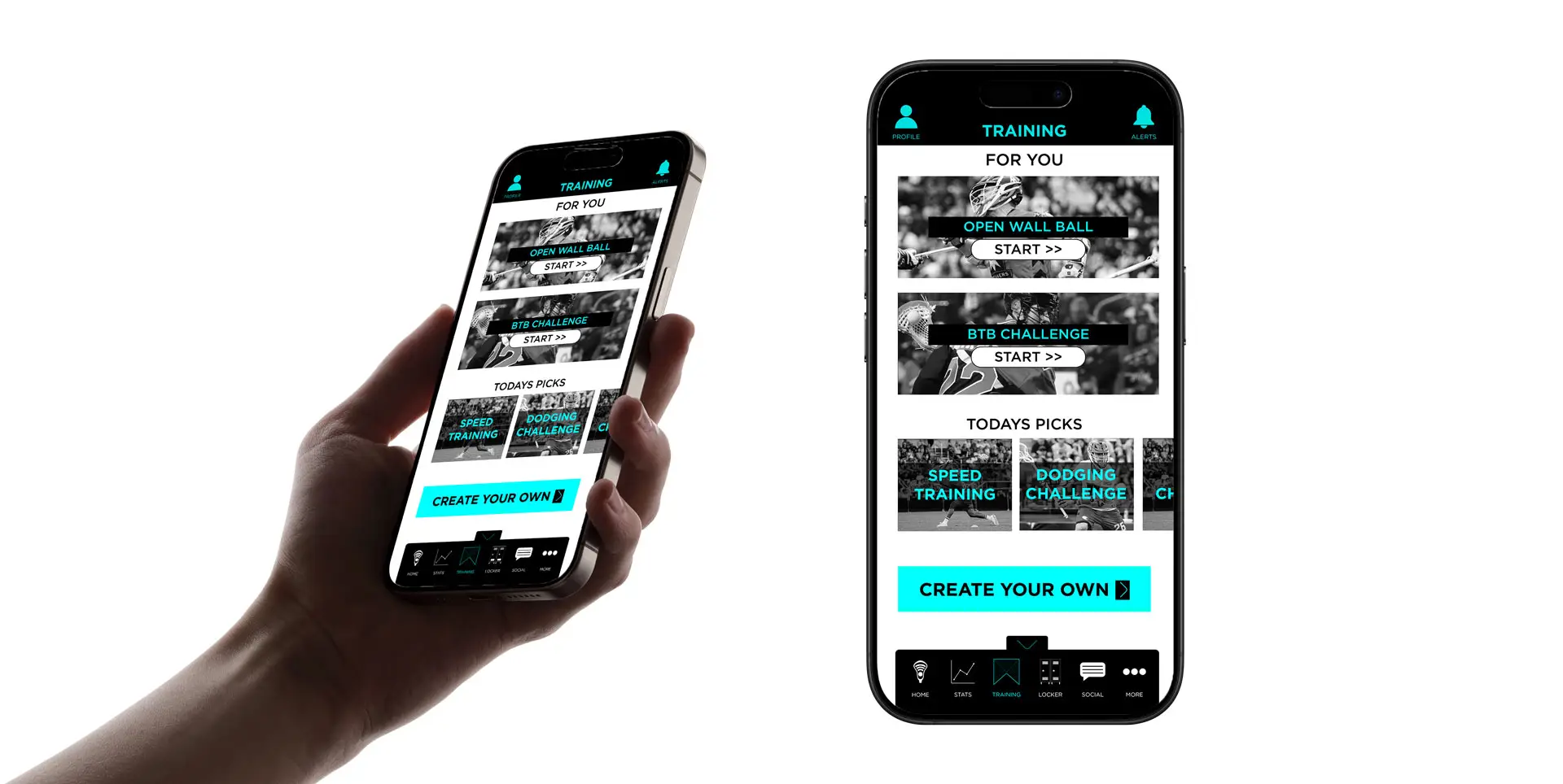
We wanted to give users more than just a way to count reps—we wanted to help them get better. That’s where the Training Hub came in. I helped shape a section of the app that offers guided drills, challenge modes, and real training sessions from top coaches and players. Whether it’s wall ball routines or full progression plans, athletes can now train smarter, stay consistent, and track their development over time—all right from their phone.
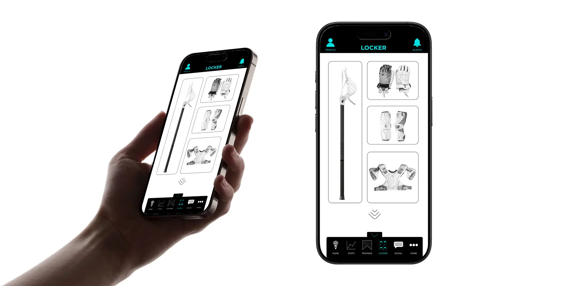
Locker: Gear, Reviews, and Shopping
Gear matters. It’s personal, it’s performance-based, and it’s a big part of the athlete’s identity. So we built the Locker—a space where players can track the gear they use, rate it, and see what others in the community are rocking. It’s part journal, part review platform, and part shopping tool. With embedded product links, players can discover, share, and purchase gear that fits their game, all without leaving the app.
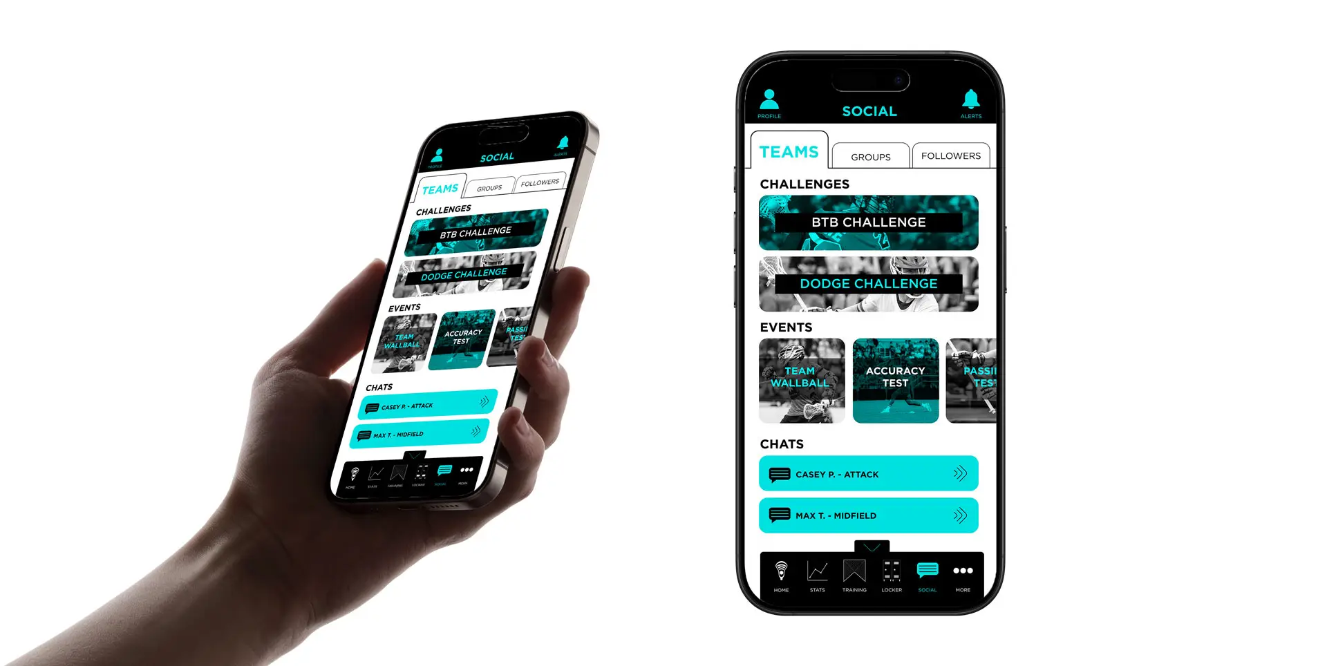
Social and Community Engagement
At the heart of SNYPR has always been community—teams pushing each other, friends competing, and players finding connection through the sport. In 2.0, we made that a core part of the experience. We introduced a social layer where users can comment, issue challenges, and celebrate streaks or big sessions. It feels like a digital locker room—full of encouragement, accountability, and a sense that you’re part of something bigger. It’s not just about training harder. It’s about training together.